Storybook: The Tool Your Frontend Project Is Missing
If you work in frontend development and haven’t tried Storybook yet, you’re likely missing out. This isn’t hype — Storybook fundamentally changed how I build and maintain components.
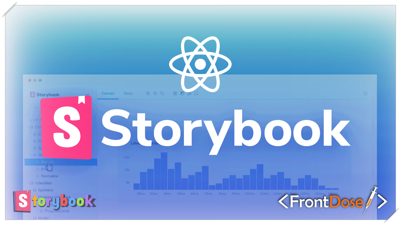
Storybook is an open-source tool that lets you develop, test, and document UI components in isolation. It sounds simple, but the benefits are significant.
Why Use Storybook?
1. Development in Isolation
The most important advantage: you can build components without running the entire application. Imagine working on a Button component — you don’t need to wait for APIs, perform authentication, or navigate through multiple pages to view it.
// Button.jsx
export const Button = ({
  variant = "primary",
  size = "medium",
  children,
  onClick,
}) => {
  return (
    <button className={`btn btn--${variant} btn--${size}`} onClick={onClick}>
      {children}
    </button>
  );
};
2. Ready-Made Component Library
With Storybook you effectively create a living style guide. Every component becomes part of documentation that the whole team can use — developers, designers, and product managers alike.
3. Visual Testing
You can view all component variations in one place. Want to see the button in a disabled state or with very long text? It’s one click away.
How Storybook Works
Storybook uses “stories” — each story represents a different state of your component.
Setup
Getting started is straightforward:
npx storybook@latest initStorybook will automatically detect your framework (React, Vue, Angular, etc.) and set up the necessary configuration.
Writing Stories
Here’s a practical example using the Button component from above:
// Button.stories.jsx
import { Button } from "./Button";

export default {
  title: "Components/Button",
  component: Button,
  tags: ["autodocs"],
};

// Primary button
export const Primary = {
  args: {
    variant: "primary",
    children: "Click me",
  },
};

// Secondary button
export const Secondary = {
  args: {
    variant: "secondary",
    children: "Cancel",
  },
};

// Large button
export const Large = {
  args: {
    variant: "primary",
    size: "large",
    children: "Large Button",
  },
};

// Disabled state
export const Disabled = {
  args: {
    variant: "primary",
    children: "Disabled",
    disabled: true,
  },
};
With the code above you already have four different stories showing the button in various states. No need to write HTML or create separate test pages — everything is available immediately.
Example with a More Complex Component
A realistic example with a Card component:
// Card.jsx
export const Card = ({ title, description, imageUrl, badge, onAction }) => {
  return (
    <div className="card">
      {imageUrl && <img src={imageUrl} alt={title} className="card__image" />}
      <div className="card__content">
        {badge && <span className="card__badge">{badge}</span>}
        <h3 className="card__title">{title}</h3>
        <p className="card__description">{description}</p>
        {onAction && (
          <button className="card__action" onClick={onAction}>
            Learn More
          </button>
        )}
      </div>
    </div>
  );
};
// Card.stories.jsx
import { Card } from "./Card";
export default {
title: "Components/Card",
component: Card,
};
export const Default = {
args: {
title: "Amazing Product",
description: "This is a great product that you will love.",
imageUrl: "https://via.placeholder.com/300x200",
},
};
export const WithBadge = {
args: {
title: "New Feature",
description: "Check out our latest feature release.",
imageUrl: "https://via.placeholder.com/300x200",
badge: "New",
},
};
export const LongContent = {
args: {
title:
"Very Long Title That Might Break the Layout If Not Handled Properly",
description:
"Lorem ipsum dolor sit amet, consectetur adipiscing elit. Sed do eiusmod tempor incididunt ut labore et dolore magna aliqua. Ut enim ad minim veniam.",
imageUrl: "https://via.placeholder.com/300x200",
},
};Addons That Make a Difference
Storybook has a rich ecosystem of addons that improve productivity:
1. Controls
Allows users to change component props dynamically through the UI.
export default {
  title: "Components/Button",
  component: Button,
  argTypes: {
    variant: {
      control: "select",
      options: ["primary", "secondary", "danger"],
    },
    size: {
      control: "radio",
      options: ["small", "medium", "large"],
    },
  },
};
2. Actions
Shows which callbacks are triggered when interacting with the component.
3. Accessibility (a11y)
Automatically checks your component for accessibility issues.
Practical Best Practices
After using Storybook for a while, I’ve adopted a few practices that help:
1. One Story Per State
Avoid generic one-size-fits-all stories — create separate stories for each important state: loading, error, empty, success, etc.
2. Use Mock Data
Create a __mocks__ folder with realistic data to use in your stories.
// __mocks__/userData.js
export const mockUser = {
  name: "John Doe",
  email: "john@example.com",
  avatar: "https://i.pravatar.cc/150?img=1",
};
3. Document Components
Use the autodocs feature and add clear descriptions for your components:
export default {
  title: "Components/Button",
  component: Button,
  tags: ["autodocs"],
  parameters: {
    docs: {
      description: {
        component:
          "A versatile button component that supports multiple variants and sizes.",
      },
    },
  },
};
Why It’s a Must-Have
Honestly: at first I thought Storybook would be another tool slowing me down. “Why write stories when I can test in the app?” I asked myself.
But after a few weeks of use I realized:
- I write better code: building components in isolation encourages reusability and reduces coupling with the rest of the app.
- I debug faster: you don’t need to reproduce an issue in the full app — create a story for the problematic state and work on that.
- Onboarding gets easier: new developers can immediately see available components and how to use them.
- You build a design system by default: over time, the Storybook becomes a practical design system for the project.
The Bottom Line
Storybook is not just another tool — it represents a different approach to building UIs. It provides a sandbox for experimentation, testing, and documentation without breaking the main application.
If you haven’t tried it yet, give it a shot. Start with a small component, create 2–3 stories, and see how it feels. Chances are you won’t want to go back.
Code with passion, create with purpose!