A Complete Small Guide to BEM in SCSS
BEM (Block, Element, Modifier) is a popular methodology for writing maintainable and scalable CSS. This guide will walk you through the principles of BEM, how to implement it in SCSS, and the best practices to follow, updated for 2024.
What is BEM?
BEM is a naming convention for CSS classes that aims to make the code more readable and easier to maintain. It divides the user interface into independent blocks, elements, and modifiers.
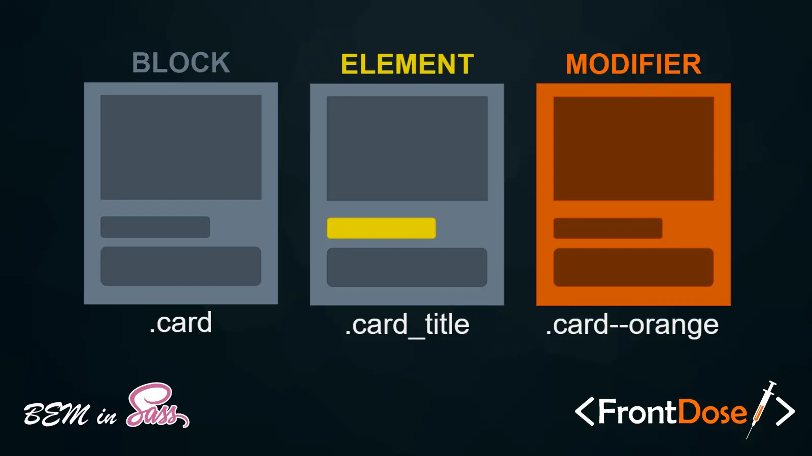
- Block: A standalone component that is meaningful on its own (e.g.,
button). - Element: A part of a block that has no standalone meaning and is semantically tied to its block (e.g.,
button__icon). - Modifier: A flag on a block or element that changes its appearance or behavior (e.g.,
button--primary).
Key Benefits of BEM
- Reusability: BEM promotes reusability of components by keeping them independent.
- Scalability: Helps in maintaining large codebases by providing a clear structure.
- Readability: Enhances readability with a consistent naming convention.
- Maintainability: Simplifies maintenance by organizing CSS in a modular fashion.
Implementing BEM in SCSS
Basic Structure
Here is how you can structure your SCSS using BEM:
/* Block */
.button {
  // Block styles
}

/* Element */
.button__icon {
  // Element styles
}

/* Modifier */
.button--primary {
  // Modifier styles
}
Nested Structure in SCSS
SCSS allows nesting, which can be used to maintain a clear hierarchy of styles:
.button {
  padding: 10px;
  border: none;
  cursor: pointer;

  &__icon {
    margin-right: 5px;
  }

  &--primary {
    background-color: blue;
    color: white;
  }

  &--secondary {
    background-color: gray;
    color: black;
  }
}
Example: Button Component
Let’s create a button component using BEM in SCSS:
.button {
  display: inline-flex;
  align-items: center;
  padding: 8px 16px;
  border: 1px solid transparent;
  border-radius: 4px;
  font-size: 16px;
  cursor: pointer;
  transition: background-color 0.3s;

  &__icon {
    margin-right: 8px;
  }

  &--primary {
    background-color: #007bff;
    color: #fff;

    &:hover {
      background-color: #0056b3;
    }
  }

  &--secondary {
    background-color: #6c757d;
    color: #fff;

    &:hover {
      background-color: #5a6268;
    }
  }
}
HTML Structure
The corresponding HTML for the button component would look like this:
<button class="button button--primary">
  <span class="button__icon">🔍</span>
  Search
</button>
Best Practices for Using BEM in SCSS
- Consistent Naming: Follow the BEM naming convention consistently across your project.
- Avoid Deep Nesting: Limit nesting in SCSS to maintain readability and performance.
- Keep It Simple: Use BEM to simplify your CSS structure, not complicate it.
- Use Variables and Mixins: Leverage SCSS features like variables and mixins for reusable styles.
- Document Your Code: Comment your code to explain the purpose of blocks, elements, and modifiers.
Conclusion
BEM combined with SCSS provides a powerful way to write scalable and maintainable CSS. By following the BEM methodology, you can create a clear and organized CSS structure that enhances readability and maintainability. Embrace BEM in SCSS to improve the quality of your web development projects in 2024 and beyond.
Stay updated with the latest practices and standards to ensure your CSS remains efficient and effective.
Code with passion, create with purpose!